MINO Cannabis
Cannabis Branding and Packaging
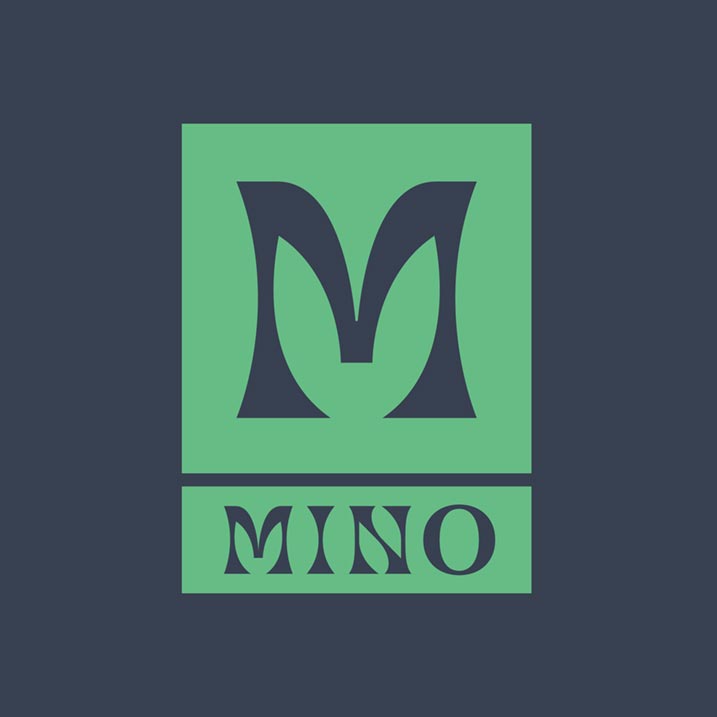
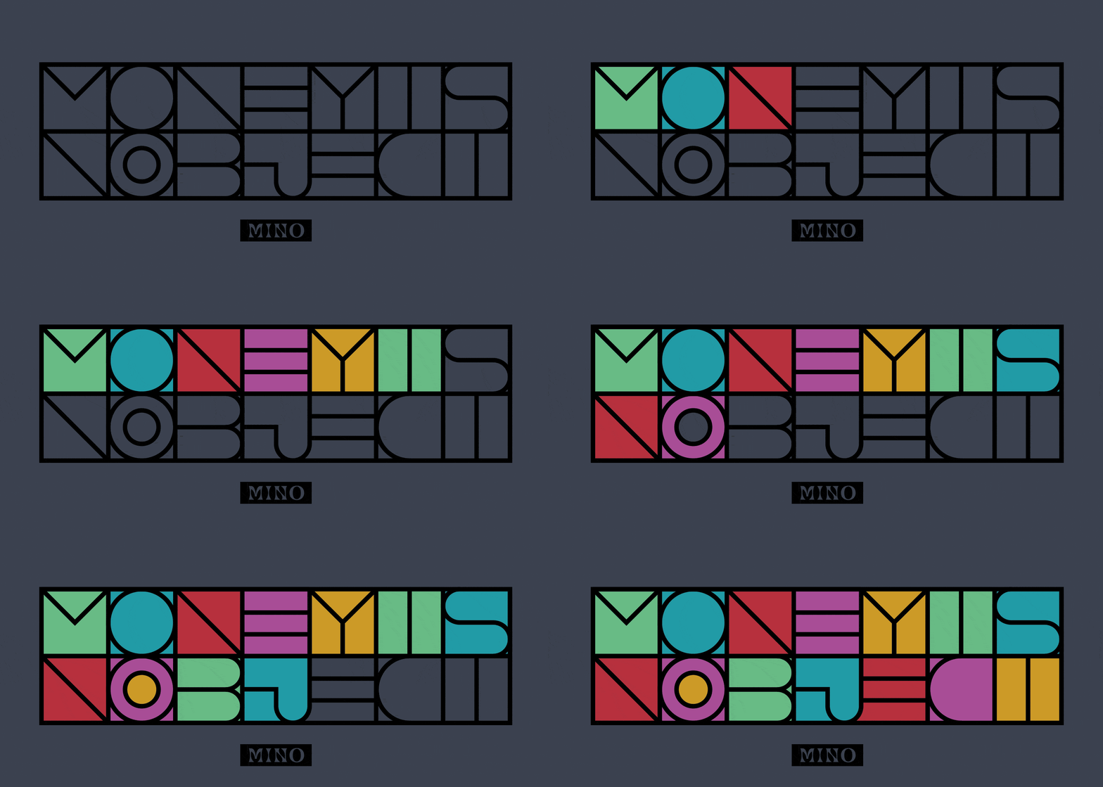
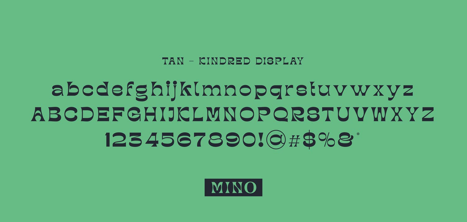
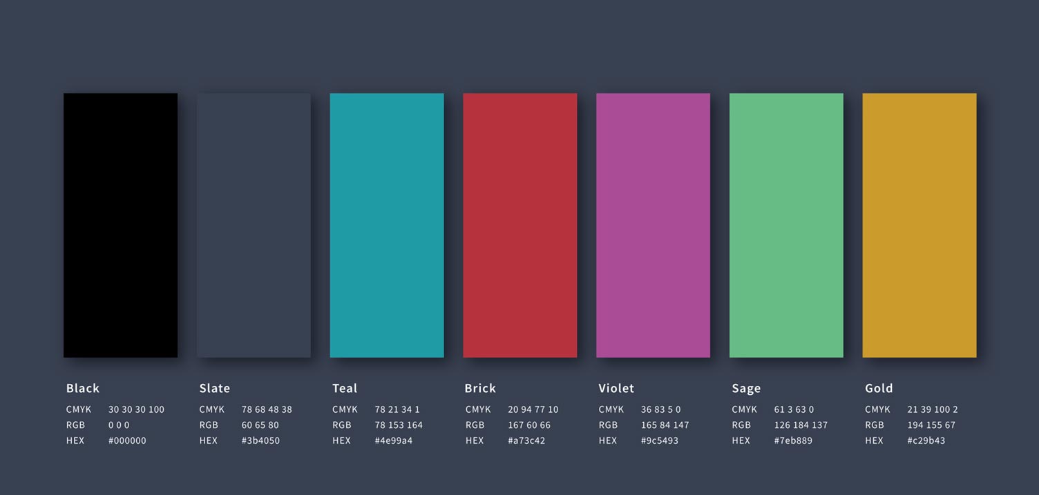
To kick things off with the MINO team, we spent time getting to know the brand inside and out. To jumpstart the cannabis branding and packaging project, we built MINO’s personality from the ground up and identified distinctive traits that would give them the ability to become trailblazers in the cannabis space. After setting up the brand voice, we created MINO’s entire visual identity, including the logo and wordmark system, color palette, and typography.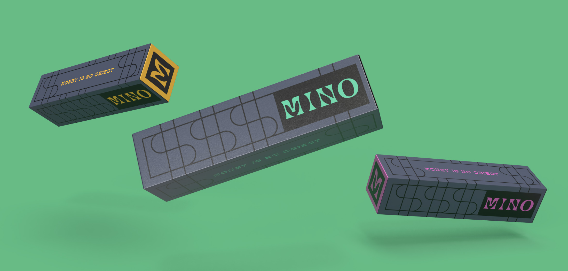
When collaborating with Grass Fed, they execute high caliber work, while keeping our bottom line in mind. One of the biggest benefits to working with Nate and the team is that they think beyond the deliverables and develop work that ties into our marketing and sales strategies. They truly understand every side of our business, and strategically make decisions that will have a positive impact.
Louie Boulahanis – Co-Founder
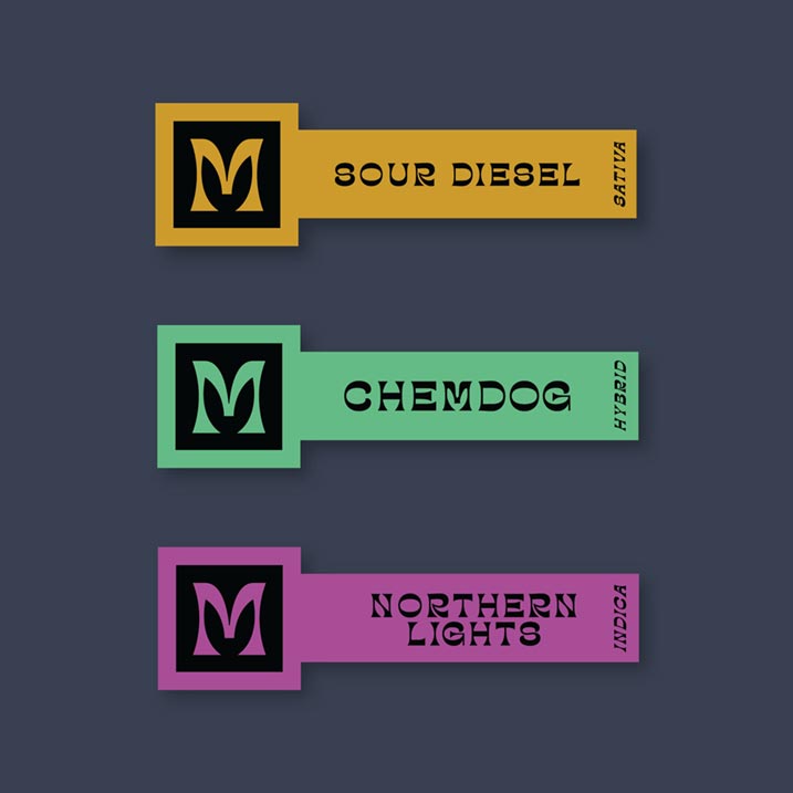
With our years of experience in cannabis package design, we developed packaging for their three main product lines; rosin, flower, and pre-rolls. We wanted the packaging to live up to their tagline, Money Is No Object.
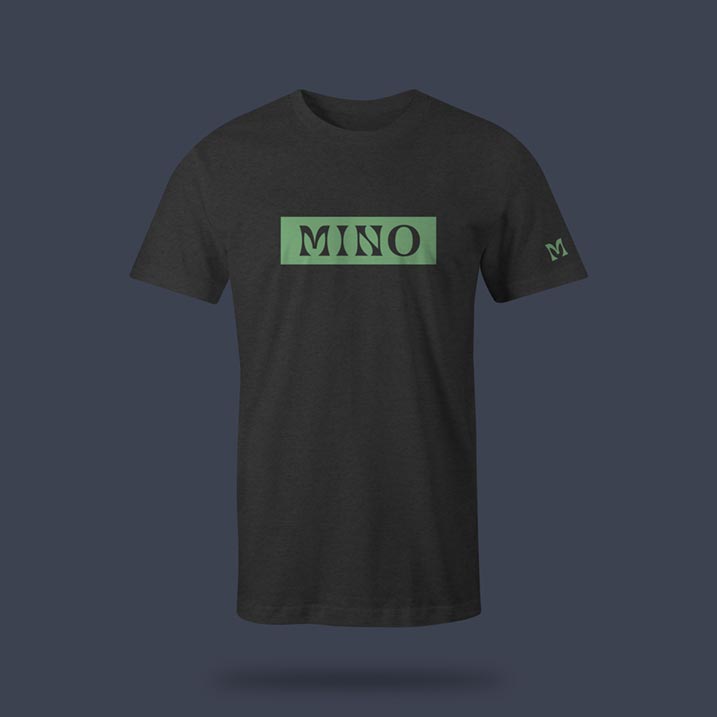
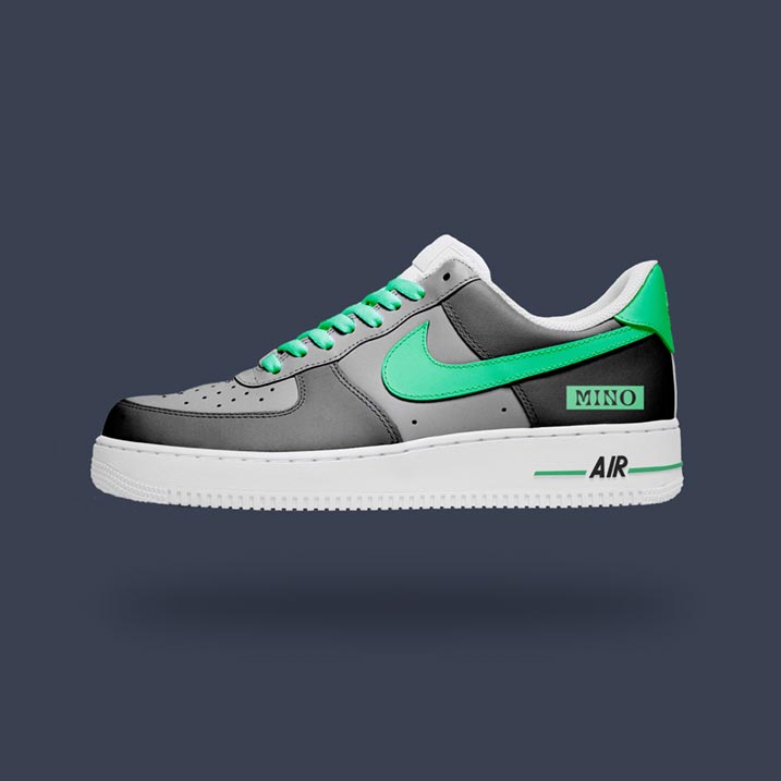
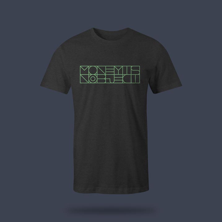
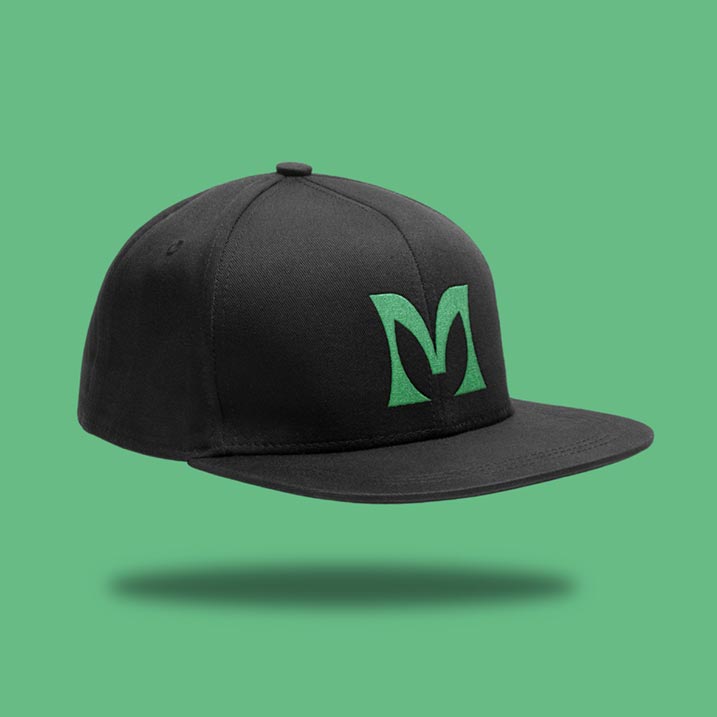
As part of MINO’s brand development, we created animations highlighting their tagline. Additionally, we designed merchandise, including hats, tees, and custom Nike Air Force 1s. As our work with MINO continues to evolve, we look forward to pushing the envelope with their bold personality and cutting-edge cannabis products.

